
You are in Wholesale Mode

TOP 10 CROSS-STITCH COLOR PALETTES TO TRY IN 2025

Choosing the right color palette can make or break your cross-stitch project. In 2025, bold contrasts, muted naturals, and timeless classics are taking center stage. Whether you’re a beginner or an advanced stitcher, these ten curated palettes will inspire fresh creativity and help you create designs that truly pop.

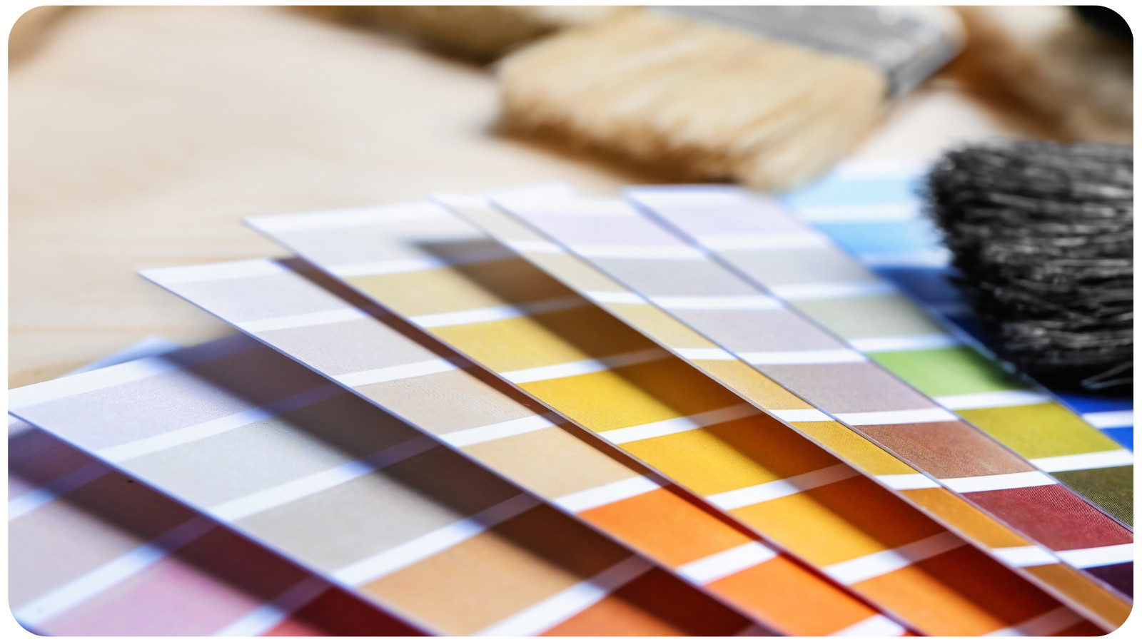
TOP 10 CROSS-STITCH COLOR PALETTES TO TRY IN 2025

WHY COLOR PALETTES MATTER IN CROSS STITCH


Colors do more than fill a pattern – they set the mood, define style, and make your work stand out. A thoughtfully chosen palette ensures harmony between threads, fabric, and design theme. This year’s trending palettes are influenced by fashion, interior design, and digital art trends, so your stitches will feel modern yet timeless.


TOP 10 CROSS-STITCH COLOR PALETTES FOR 2025

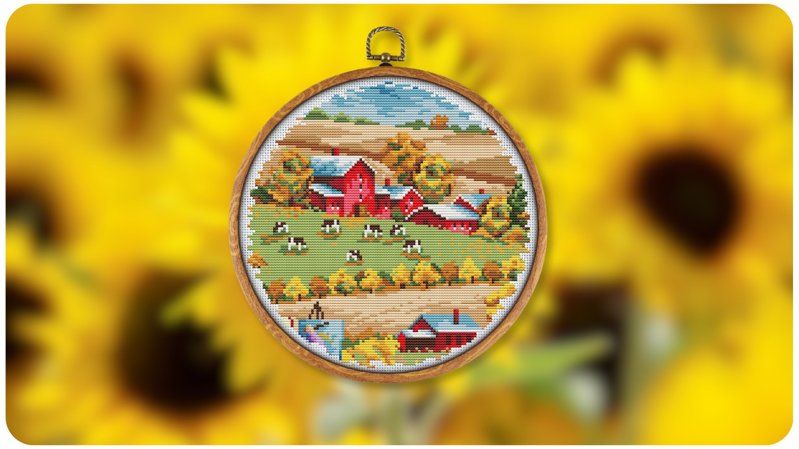
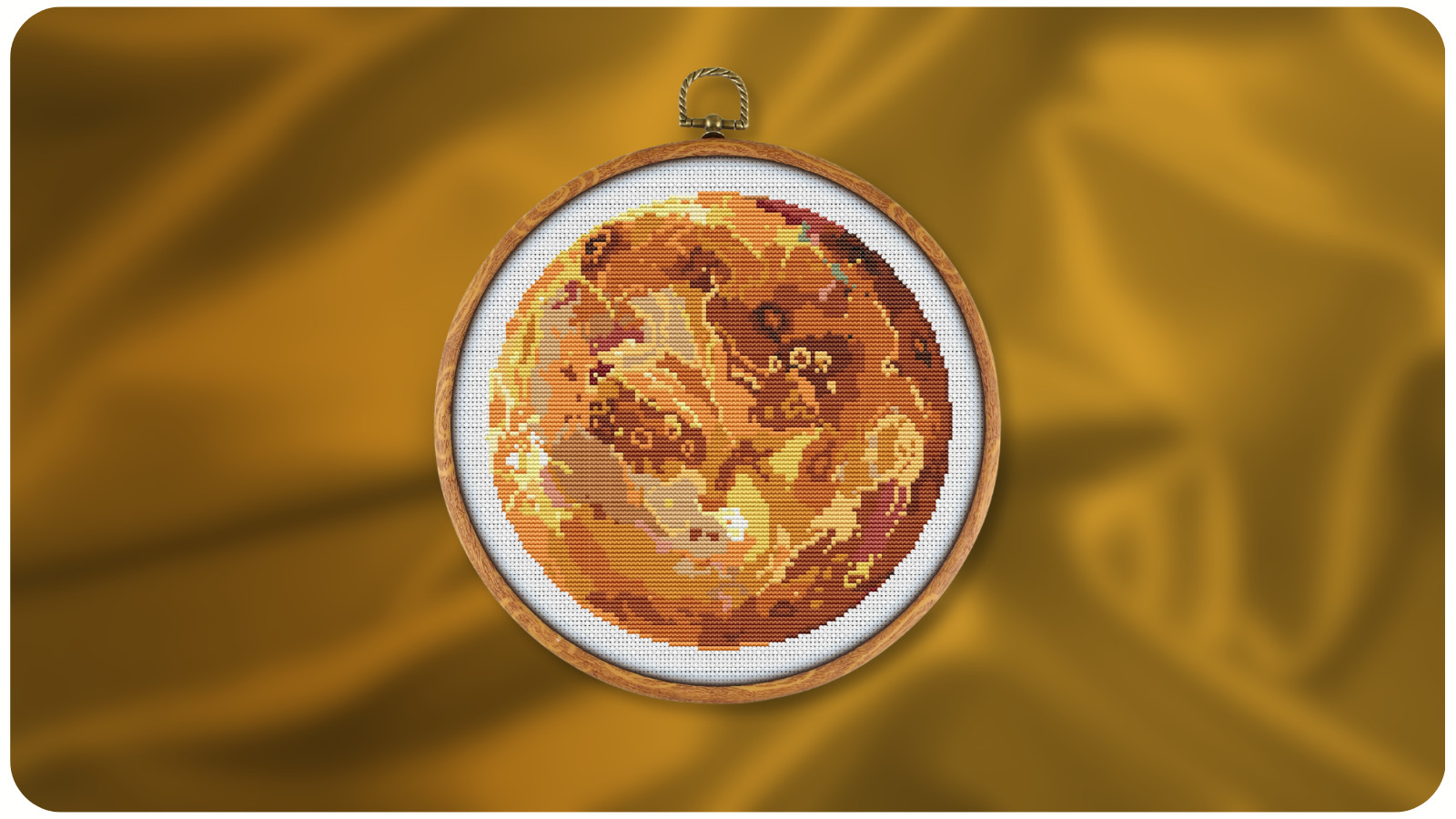
1. Warm Autumn Glow


- Key Shades:
Burnt orange, deep gold, warm taupe, brick red, olive green

- Best For: Seasonal samplers, rustic landscapes, Thanksgiving motifs
- Why It Works: These tones create depth and coziness, perfect for adding warmth to any home décor project. Pair with natural linen fabric for a textured, earthy finish.


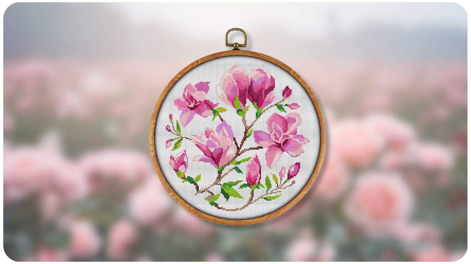
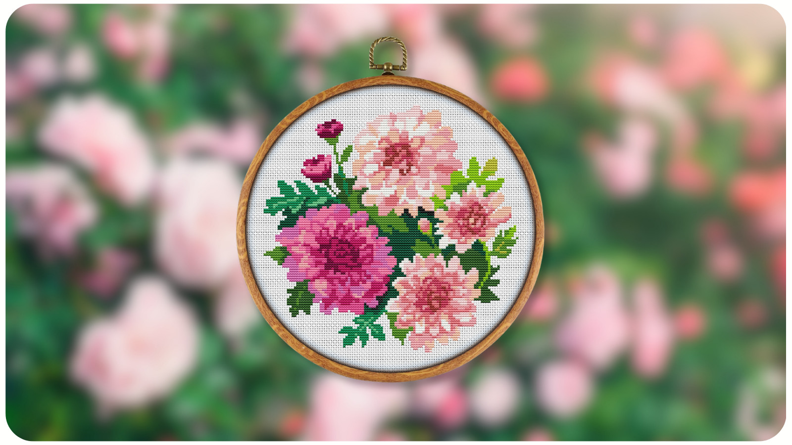
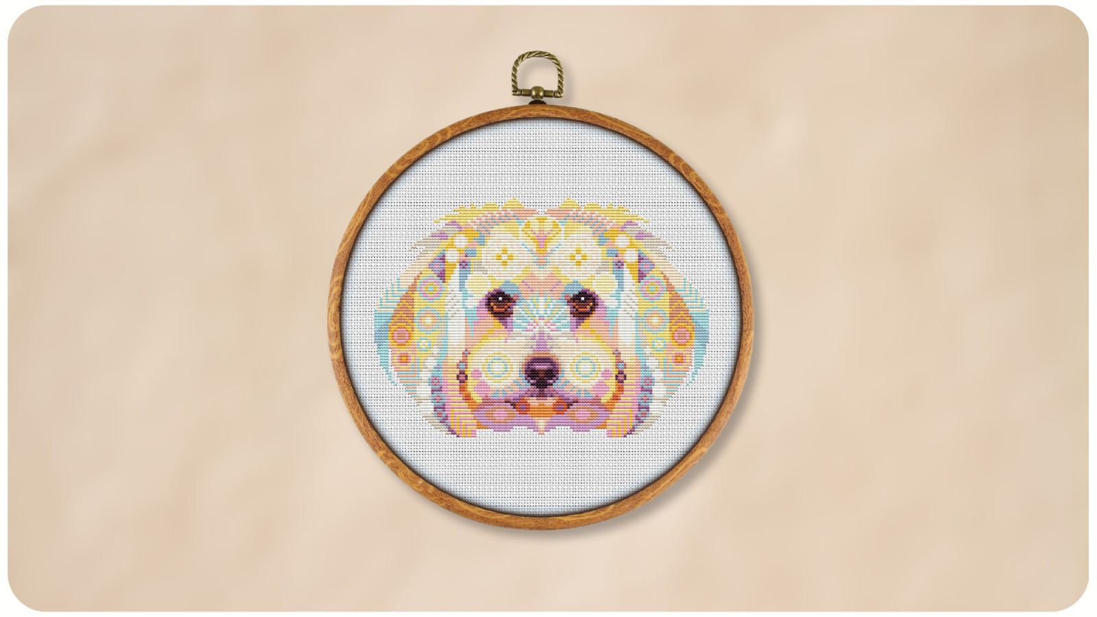
2. Soft Pastel Florals


- Key Shades:
Blush pink, lavender, buttercream, sage, powder blue

- Best For: Wedding samplers, spring florals, baby-themed patterns
- Pro Tip: Use subtle backstitching in light gray to enhance detail without overpowering the delicate colors.


3. Bold Bohemian Mix


- Key Shades:
Turquoise, fuchsia, mustard, coral, royal blue

- Best For: Mandalas, ethnic-inspired designs, abstract patterns
- Why It Works: High-contrast colors create visual energy. Ideal for wall art that needs to grab attention.


4. Minimalist Monochrome


- Key Shades:
Multiple tones of one hue (e.g., blues from navy to sky)

- Best For: Geometric patterns, typography, modern décor pieces
- Pro Tip: Experiment with tone-on-tone stitching for subtle depth, especially on matching fabric colors.


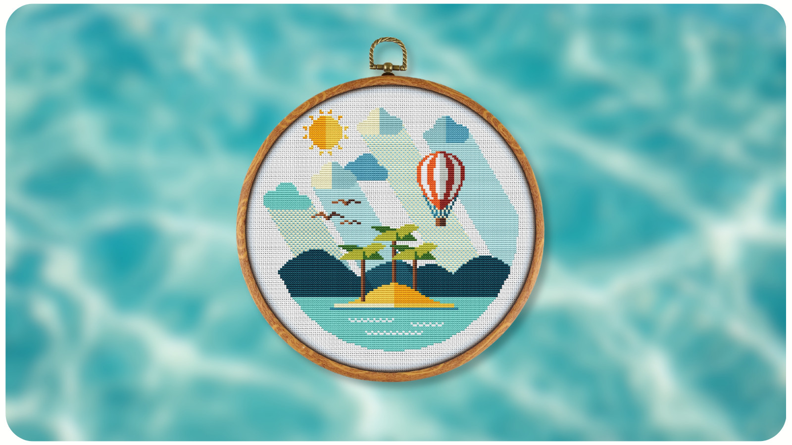
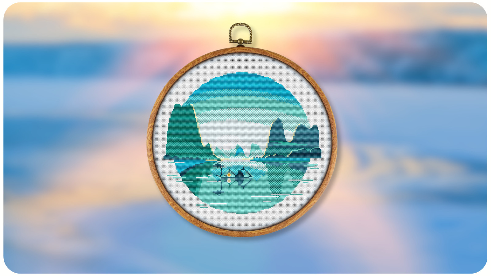
5. Coastal Breeze


- Key Shades:
Seafoam, sand beige, driftwood gray, ocean blue, white

- Best For: Nautical themes, beach scenes, summer samplers
- Why It Works: These colors evoke calm and freshness – perfect for creating relaxing, holiday-inspired designs.


6. Vintage Rose Garden


- Key Shades:
Rose pink, burgundy, dusty green, cream, antique gold

- Best For: Victorian samplers, botanical art, romantic pieces
- Pro Tip: Choose slightly muted thread tones to mimic the aged look of antique embroidery.


7. Jewel-Tone Luxury


- Key Shades:
Emerald, ruby, sapphire, amethyst, gold

- Best For: Holiday designs, ornate patterns, regal motifs
- Why It Works: Rich tones paired with metallic accents create an opulent, eye-catching finish.


8. Scandinavian Winter


- Key Shades:
Ice blue, snow white, charcoal gray, cranberry red, pine green

- Best For: Nordic patterns, snow scenes, Christmas projects
- Pro Tip: Use high-contrast thread on white fabric to make details pop in winter-themed stitches.


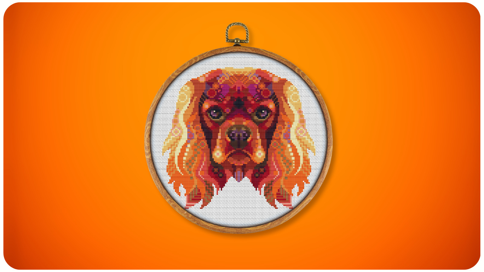
9. Earthy Neutrals


- Key Shades:
Mocha, cream, clay, olive, charcoal

- Best For: Minimalist décor, nature scenes, animal designs
- Why It Works: This palette blends seamlessly with modern interiors and works well with wooden embroidery hoops for display.


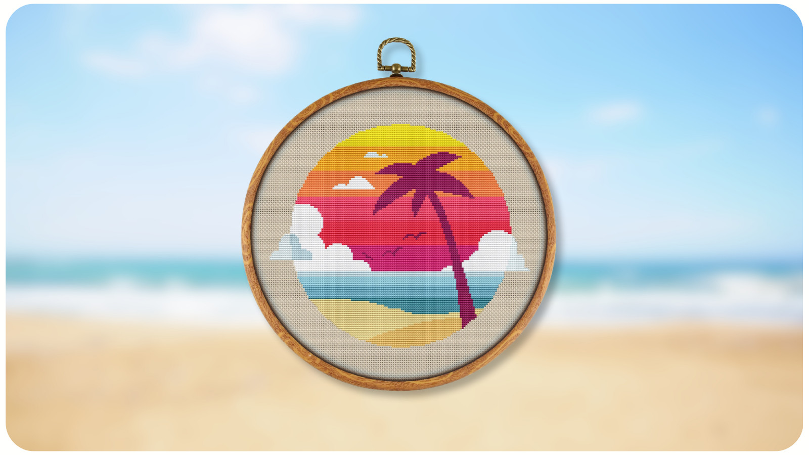
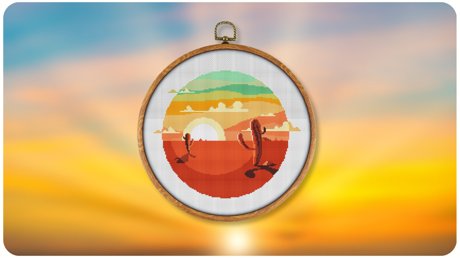
10. Sunset Gradient


- Key Shades:
Peach, coral, magenta, violet, indigo

- Best For: Skies, abstract art, travel-inspired designs
- Pro Tip: Use variegated floss for effortless color transitions and a painterly effect.


HOW TO CHOOSE THE RIGHT PALETTE FOR YOUR PROJECT


Consider the Mood


- Warm palettes = cozy and inviting
- Cool palettes = calm and soothing
- High-contrast palettes = bold and energetic

Match Fabric & Thread. The same thread color can appear drastically different on white vs. oatmeal fabric. Always test your palette on a small swatch before starting.

Follow the 60-30-10 Rule. A design looks balanced when:

- 60% = dominant color
- 30% = secondary color
- 10% = accent/highlight color


PRO TIPS FOR WORKING WITH COLOR PALETTES


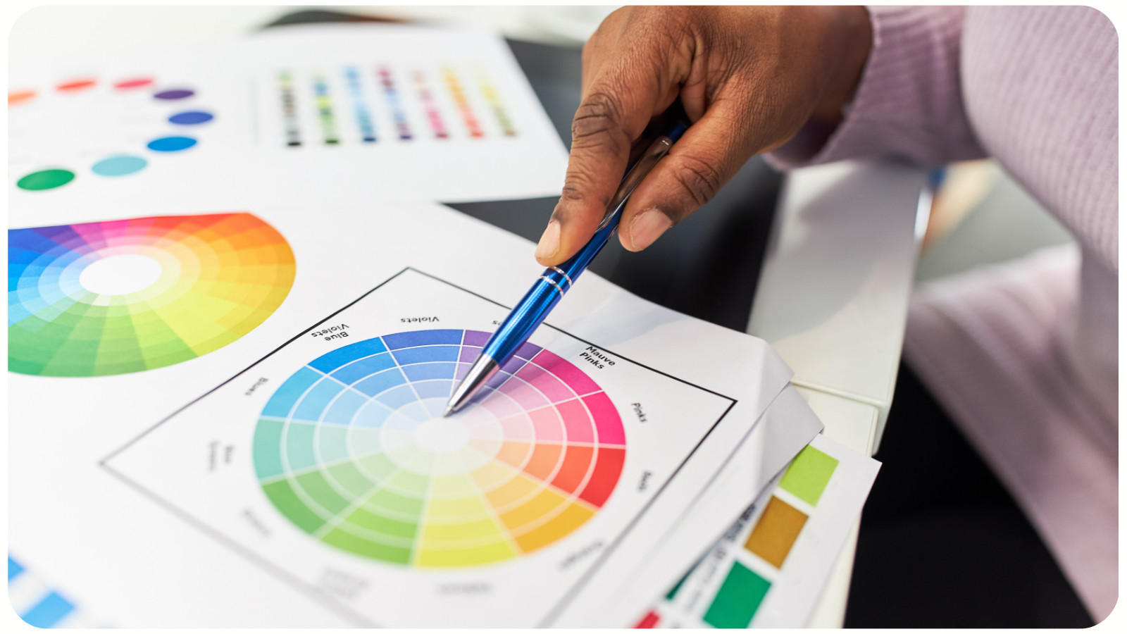
- Use a Color Wheel
: This helps create harmonious combinations and avoid clashing shades.

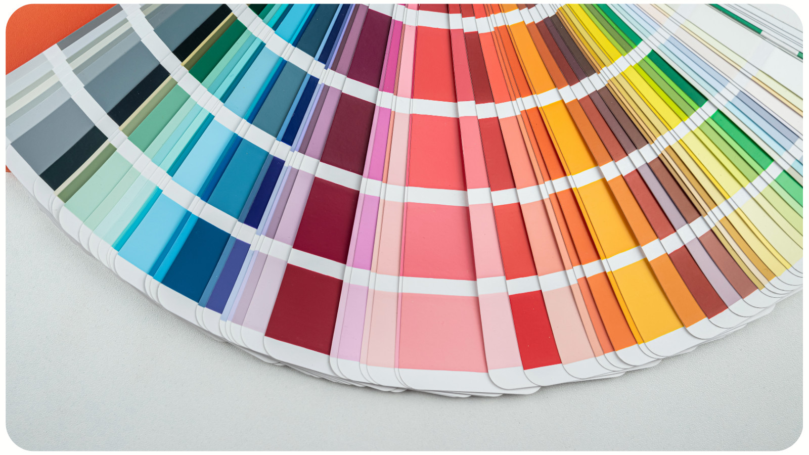
- Invest in Thread Cards: Seeing physical thread samples is more accurate than relying on screen colors.
- Experiment with Blended Threads: Combine two strands of different colors for unique, custom tones.
- Keep Seasonal Palettes Handy: Store your go-to palettes for quick project planning.


CONCLUSION: STITCH WITH CONFIDENCE

Color is one of the most powerful tools in your cross-stitch toolkit. Whether you choose warm autumn tones, pastel florals, or bold jewel hues, the right palette will transform your stitches into works of art. In 2025, embrace experimentation – mix modern trends with your personal style to create pieces that are both timeless and uniquely yours.