


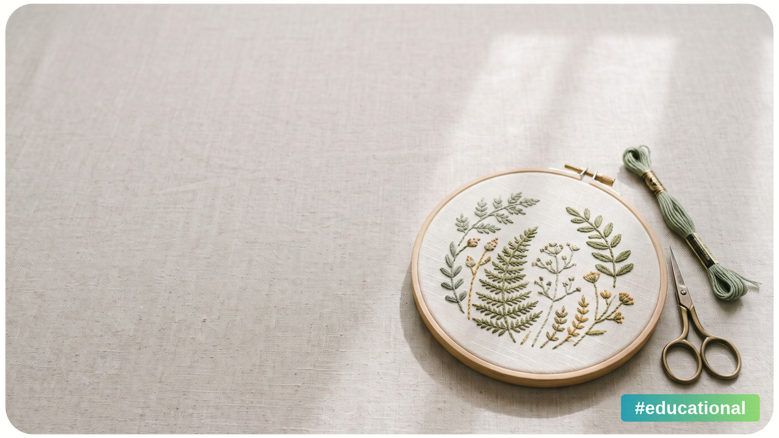
Negative space in art is the area around and between the main shapes. It can make a detailed design easier to read by separating forms, preserving recognizable outlines, and giving important details room to stand out. A richly shaded bird or detailed flower can remain complex while the space around it stays simple.
A design is easy to read when you can recognize the subject and see how its parts fit together. Check that clarity at the size and distance where the work will be seen.
What Counts as Negative Space?
Positive space is occupied by the main subjects or shapes. Negative space surrounds or separates them. Think of a leafy branch: the leaves and stem form positive shapes, while the openings between them form negative shapes.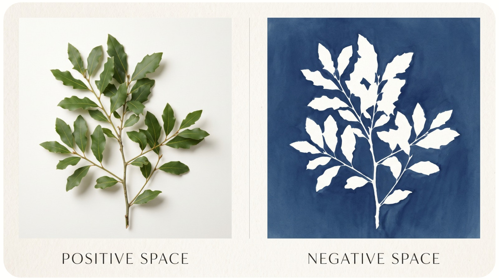
Those openings have outlines of their own. A narrow triangle between two leaves can matter as much as either leaf.
Negative space does not have to be white, bare, or completely uniform. Dark fabric around embroidered flowers can be negative space, as can a painted sky around a building. The Georgia O'Keeffe Museum uses her Ritz Tower (1928) to explain this relationship: the building is positive space, and the surrounding clouds and sky are negative space.
A background can contain color and gentle variation while leaving the subject clear. A background crowded with equally prominent objects, however, may offer little visual separation.
How Negative Space Helps Detailed Designs Stay Clear
It preserves the outline that identifies a subject
Imagine a bird with carefully drawn feathers, surrounded by small leaves. In one version, a leaf touches the tip of its beak. In another, that same leaf sits slightly farther away. Keep everything else unchanged.
The second version may make the beak easier to recognize because its edge is separate from the leaf. The improvement comes from a small opening at a meaningful point.
When reviewing a design, look around identifying features first: a bird's beak, an animal's ears, a flower's outer petals, or a letter's enclosed opening.
It separates groups without removing their detail
Picture three clusters of berries in a decorative border. Small gaps within each cluster and larger gaps between clusters can help each bunch read as a unit.
Try keeping the berries unchanged and adjusting only the distance between the bunches. If the border becomes easier to follow, the problem was likely the arrangement rather than the amount of detail inside each group.
It supports a focal point
A focal point is an area you want viewers to notice. Artists can create emphasis through differences in size, color, shape, or texture. Spacing can also help distinguish one area from its surroundings.
For a floral composition, try leaving a slightly wider opening around the largest bloom while keeping smaller flowers closer together. That pause may help the main flower stand out.
Space works alongside contrast. A pale flower against pale fabric may still be difficult to distinguish even when it has generous room around it.
Where to Look for Negative Space in Craft Projects
In craft projects, check both the spaces inside a motif and the background around it.
Cross-stitch: check the spaces inside the motif
Unstitched fabric can provide negative space in a cross-stitch design, but an outer margin does not solve every crowded composition. Look inside the motif too: between an animal's legs, beneath a branch, or around small lettering.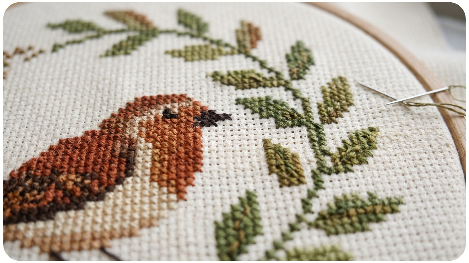
For example, a generous fabric border around a bird will not separate its beak from a nearby leaf if those shapes already merge within the chart.
When comparing cross-stitch patterns, inspect the finished preview as well as close-up details. If you are following an existing chart, preserve its planned stitches and blank areas. Treat changes to spacing as a redesign to test separately.
Hand embroidery: consider the fabric as part of the picture
For a self-drawn botanical arrangement, sketch the full composition before transferring it. When comparing embroidery patterns, notice how the visible fabric surrounds the motifs. Check whether stems leave useful openings and whether separate flower heads remain distinct.
Fabric choice matters too. A scattered print may introduce shapes into the spaces you expected to look quiet. Compare the same sketch against a plain fabric and a patterned fabric before deciding.
This is a visual composition check. Adding open areas does not, by itself, correct puckering or thread-tension problems.
Diamond painting and full-coverage artwork: look for visual openness
In a full-drill diamond painting, drills cover the designated picture area. A broad sky or simple background can still function as negative space in the composition, even though that area is physically filled.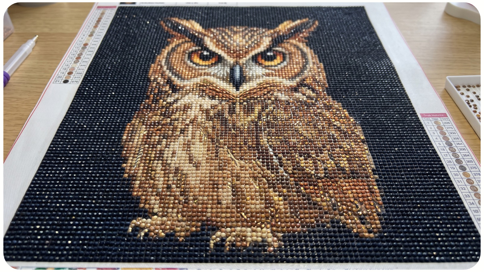
When comparing diamond painting designs, look for separation around the subject and quieter areas within the picture. A complex owl against a simple dark background may have clearer boundaries than the same owl surrounded by equally detailed branches.
Follow the canvas instructions for coverage. Create this effect through the pictured composition rather than leaving specified drill areas unfinished.
Is the Problem Spacing, Contrast, or Scale?
Start by viewing the whole design at its intended size. Then check the place where recognition becomes difficult.
Checks for spacing, contrast, and scale | ||
What you notice | What to check | An adjustment to try in a draft |
|---|---|---|
Two shapes seem joined | Do their edges touch or nearly touch? | Move one slightly, or make the overlap deliberate and clear. |
A subject fades into its surroundings | Are the subject and background similarly light or dark? | Adjust light-dark contrast before adding more space. |
Detail looks clear enlarged but muddled at final size | Do important gaps remain visible? | Enlarge a key opening or simplify nearby small marks. |
Individual motifs look clear, but the arrangement feels scattered | Are related motifs as far apart as unrelated ones? | Bring related motifs closer and separate the groups. |
These checks suggest possible causes. Test one adjustment at a time so you can see which change helps.
For color work, a grayscale photograph can help you compare value, meaning how light or dark something appears. Use it as an additional check: it leaves out color differences and may not capture the surface accurately.
How Much Negative Space Is Enough?
There is no single percentage that suits every artwork. A dense repeating pattern and a single embroidered sprig have different purposes. Some designs invite slow exploration rather than immediate recognition.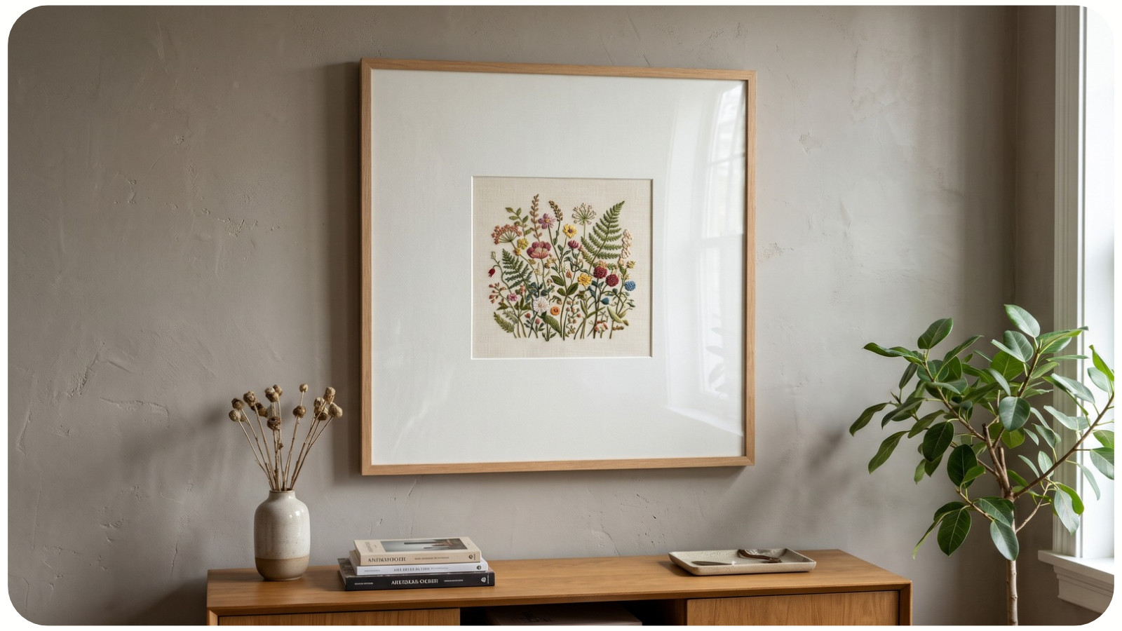
Ask whether the spaces preserve the distinctions that matter in this design.
A detailed pattern can have very little open background yet retain clear gaps between repeating shapes. A sparse composition can still be confusing if two important edges collide.
Check the finished format, too. A gap that looks generous in an enlarged screen preview may be hard to see on a small ornament. A wide outer margin may become narrower when the work is framed. For stitch designs, check the visible opening of the planned hoop or frame. Leave the separate fabric allowance your chosen finishing method requires.
If the work will be displayed, view it from a realistic distance. If it will also appear in small online photographs, check that view separately.
Try a Two-Version Spacing Test
Choose a small sketch of your own, such as a bird on a branch or a group of three flowers. Use paper and a pencil, or duplicate the sketch digitally.
1. Choose the detail that must remain clear. It might be the bird's beak or the separation between flower heads.
2. Copy the arrangement. Keep the subject sizes, colors, and internal details the same.
3. Change only one gap. Move a nearby leaf, separate two blooms, or widen an opening between branches.
4. Compare both versions at the intended size. Check whether the important feature is clearer and whether the arrangement still feels connected.
You can also sketch only the spaces between the objects, an approach used in the Georgia O'Keeffe Museum's teaching activity. This makes it easier to inspect the openings as shapes.
Keep the version that supports your purpose. If a gap helps explain an edge, separate a group, or preserve a useful opening, give it the same care you give the stitched or painted details.
Sources and Further Reading
• Getty: Elements of Art. Positive and negative space, and value.
• Getty: Principles of Design. Emphasis and visual contrast.
• Georgia O'Keeffe Museum: Positive and Negative Space. The Ritz Tower (1928) example and drawing exercise.
• Diamond Art Club: Full Drill vs. Partial Drill. Diamond painting coverage terms.